 We’ve all heard the admonishment, “Don’t judge a book by its cover.” Whoever said that clearly wasn’t trying to sell books in the 21st century. Regardless of whether it’s consumers, bookstore buyers, or the folks making nominations for the Worst of Amazon, everyone is judging books by their covers. Why? The simple truth is, a great book with a horrible cover won’t sell, but a horrible book with a great cover will.
Authors and self-publishers need to put as much thought into their book’s cover as they do the content between the covers. The smartest thing to do is hire a professional cover designer. This is because every book requires multiple cover files, how many depends on how the book is distributed. The best recommendations for cover artist come word-of-mouth. If you attend an author event and see someone with a cover that catches your attention, ask for the name of their artist. Most authors are happy to share that information.
Good Covers Drive Sales
Below are two cover examples from the same author, in the same series. You don’t need to be psychic to figure out which book generates more sales.

For custom covers, it’s possible to hire freelancing graphic designers from sites like upwork.com, fiverr.com, and golance.com. Those who are unsure of what they want on their cover can find a variety of options from dedicated cover design sites like 99designs.com. For a minimum bid of $400, an author can solicit submissions from dozens of artist, then choose the cover most likely to resonate with their target audience. Those looking for cover packages that include images for marketing and social media should check out Damonza.com. Not only do they have great package deals, but their portfolio includes covers from several USA Today and New York Times best selling authors.
The cover artist you hire needs to be familiar with the necessary cover elements of the genre in which you write. Romance authors will want a scantily clad couple in a pose that radiates passion. For action, adventure, or westerns, the cover should include the good guy, the bad guy, and a weapon. Planning ahead is important for those writing a series, as all books in the series need to have similar elements so readers can immediately recognize that the group of books belongs together.
How a Series Should Look

Credit: Book series covers by CirceCorp for Indieeditress
With the series above, you don’t even need to be able to read the titles to know the books belong together. Each title is distinct, yet they are tied together by using the same font, drawing on a common theme, and employing similar design elements.
It is also important to hire a cover designer who you feel comfortable working with. A book is more than just the front cover. The initial cover design is just the first step toward developing a finished product which will include multiple files. How many files the author needs depends on how many book formats will be distributed. This means you may be working with the cover artist for years.
Commonly Needed Cover Files
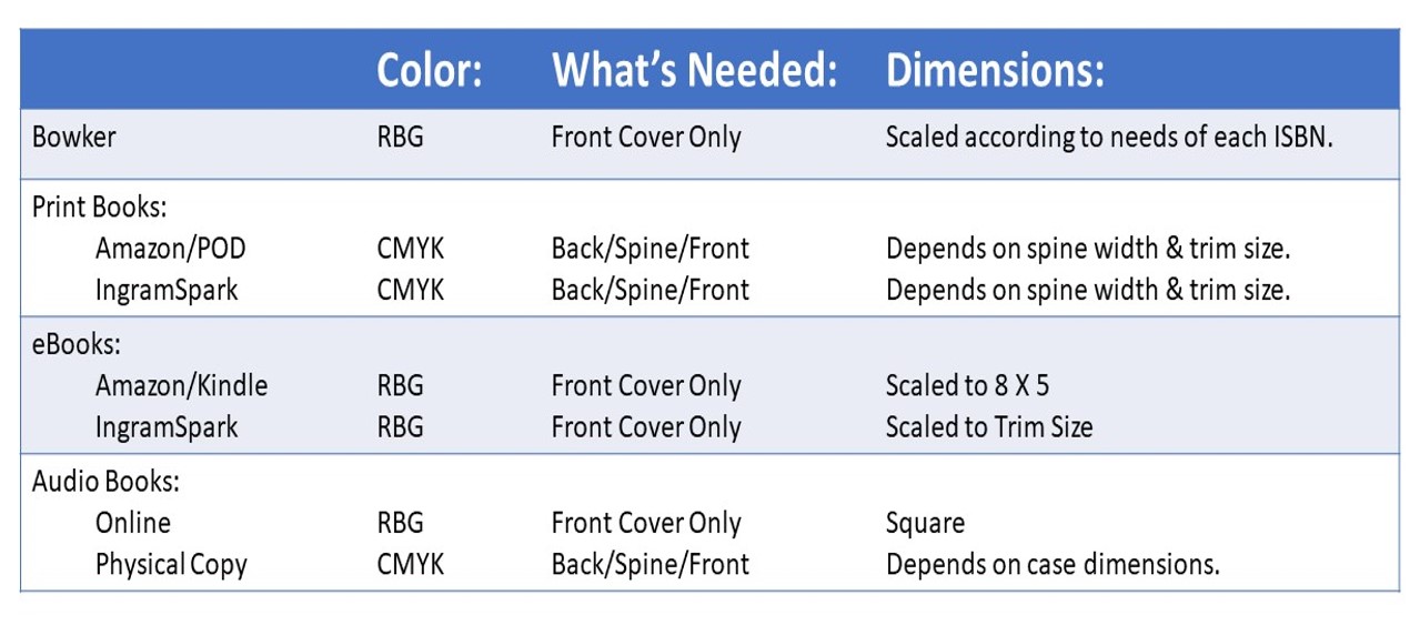
Common trim sizes range from 8 X 10 for children’s books to 4.25 X 7.75 for mass market paperbacks. An author needs to decide on a trim size BEFORE commissioning a cover. When assigning ISBNs with Bowker, the front cover of each format must be uploaded, so if you have print, ebook, and an audio book, that’s three separate files. Amazon/KDP wants all files scaled to 8 X 5 to accommodate a Kindle screen, regardless of the actual dimensions of the book when printed. Files that only appear online should be .jpeg or .png, done in RGB. Files destined for print must be CMYK and need to have high quality resolution. Regardless of format or program used, all print files need to be at least 300 dpi.
If you don’t plan to market the book commercially, it’s possible to save some cash by engaging in a little DYI and create a cover yourself using Gimp, Photoshop, or PageMaker. However, there are a lot of pitfalls authors need to avoid when creating covers. The first is not realizing that a book is a three dimensional object.
When the SFCC Pullman Campus Creative Writing Club students created their budget for next year, they asked for additional money to hire a cover designer so their advisor (yes, that was me) wouldn’t have to create the covers. The main campus insisted hiring someone wasn’t necessary–they would have someone from marketing or graphic design create the cover. The resulting file was unusable.
I knew the file wouldn’t work before I even opened the email attachment. The SFCC email system does not accommodate large files. Not even after they have been flattened. Not even after they have been zipped. In order to send last year’s cover file to the printer I had to save it to a flash drive, take it home, and use my personal email.
When I opened their file, I gasped in horror. None of the aspects of good cover design were adhered to. They hadn’t used the art chosen by the club last October. Instead, Spokane created something entirely new, which didn’t match the prior cover, give any indication of genre, wasn’t print quality, and wasn’t the proper dimensions, either. No spine, no back cover, no ISBN, no barcode, nothing.
One Of These Things Is Not Like The Others
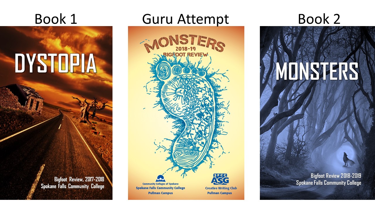
Dystopia, Book1, was last year’s publication. The cover created by Spokane’s marketing and graphics gurus is labeled “Guru Attempt.” The artwork the club chose for this year’s anthology is labeled Book 2. The cover of Dystopia and the Guru Attempt are so divergent that there is nothing to indicate they were created as part of an ongoing project, let alone by the same authors, or even the same publisher. Any reasonable printer would reject the guru file because it was woefully incomplete. Fortunately, this irksome problem was brought to my attention in time to develop another file and avoid a printing crisis.
Because printing occurs from left to right, this is how the file would have looked when placed on a book:
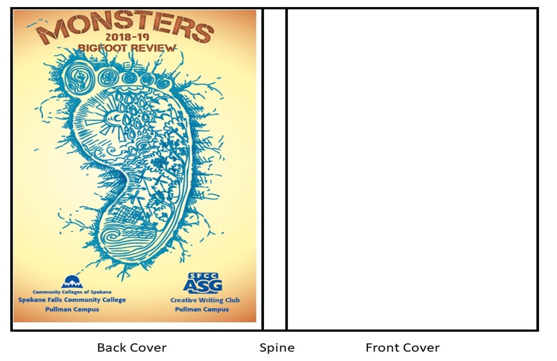
Here, what was supposed to be the front cover, ends up on the back cover. It’s slightly off center because the file’s creator did not account for trim, which is also the reason for the white edge along the spine and bottom of the back cover. Neglecting to consider the book as a three dimensional object ends up leaving the spine and front cover completely blank. Since the barcode and ISBN are also missing, this book is unsalable and, no doubt, would have garnered a Worst of Amazon nomination had the club managed to find anyone willing to print it. To ensure that publication went forward, I volunteered my time, without contract or any form of pay, all summer to create a usable file.
To avoid the mistakes of the SFCC graphics guru, make sure your file is full bleed. Bleed means that the images extend into the margins. Full bleed means that the image extends beyond the margins. This is done to account for trim. Anyone who has ever attempted restack a pile of papers knows the edges never align perfectly. To get the perfect edges you see on a book, the three loose edges are cut to the appropriate size after the book has been assembled. The trim width for their chosen printer was 0.125” on the three cut sides.
Cover Elements: Back, Spine, and Front
The back cover appears first on the file because the cover is wrapped around the book. A common mistake of first time self-publishers is to reverse the order of the back and front covers, which gives the book a somewhat silly appearance. Back cover art should be simpler than the front cover because the blurb, ISBN, barcode, and imprint must be overlaid.
The spine is the hardest element to complete. Spine lettering runs from top to bottom in American markets and is reversed in European markets. The spine width depends on a number of factors. Mass market paperbacks use a grey paper slightly thicker than news print. Hardcover books tend to use thicker paper. Off white or cream paper is thicker than white paper of the same weight. It is impossible to know the spine width until the interior file of a book has been sent to the printer. Once the printer has the page count and knows which weight and color of paper the author/publisher wants, then the spine width can be determined and the cover artist can complete the file.
The front cover needs to clearly portray the genre and emotional feel of the book, have an easy to read title, and the author’s name. It also needs to resemble other books in the same series.
Creating a book cover involves more than just art, it also involves math. For a 6 X 9 book with a spine width of .21”, the dimension of the cover file must be 12.46” X 9.25” to account for trim. The final product of this year’s anthology cover is below.
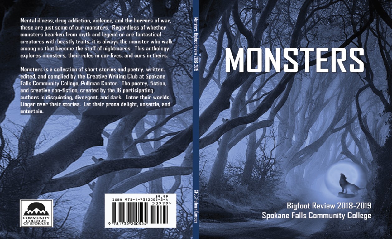
While this book’s cover will win no awards, at least it has all the correct elements and covers the entire book. With any luck, it will catch someone’s eye and result in a sale or two. The proceeds of all sales go to the Pullman Campus Creative Writing Club. Estimated publication date: August 6, 2019